Emotional Response


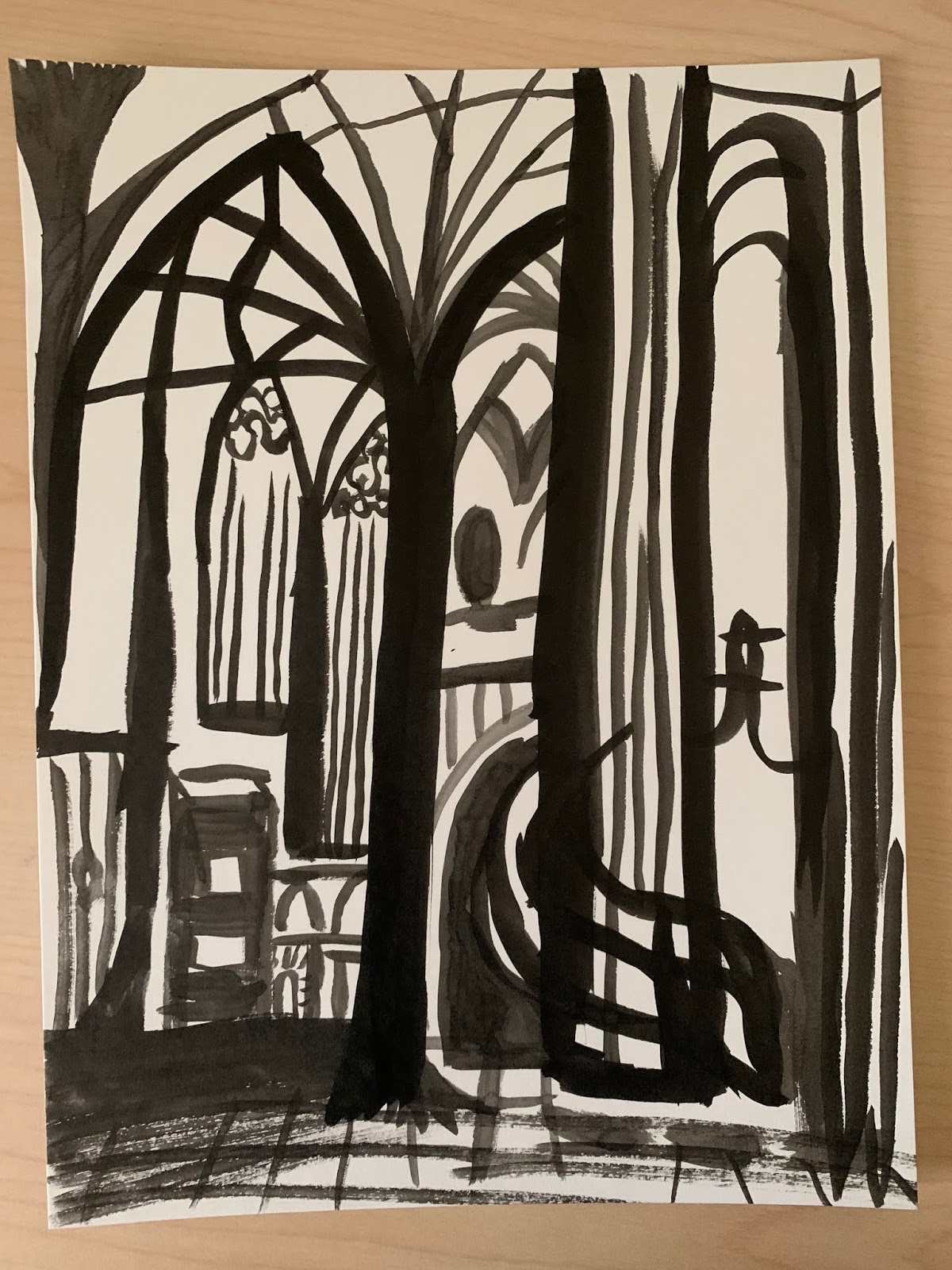
The first image is the original image that I used as my inspiration for my other images. I took this image inside a cathedral in Budapest, Hungary. It was possibly the most gorgeous churches I have ever seen. The second image is the spiky and brittle image. I actually had a tough time creating this image because I really wanted to go with the curvature of the architecture in the original image. It was tough to create the entire image out of just straight lines, but I really enjoyed how it turned out because it gave it a more abstract concept of gothic architecture. The third image was my soft and pliable image. I used a different concept of color in this image. I used blue, black and yellow as my only colors to recreate this image. I really wanted to have soft colors and soft shapes to demonstrate the fluidity of the architecture inside the church. The forth image I used the Japanese pen and ink to create a sinister and creepy look. As churches are most beautiful, they can be very easily created into something horrifying. I think that the solid black color and the thickness of the lines created this idea perfectly. I also added a black and white filter to create a "dead" feeling to the painting. The last image, is a more simplified version of the sinister image. Gothic architecture is perfectly flamboyant, so I thought it was appropriate just to include main shapes of the image instead of the details. I did this to emphasize how the lines in the photo really gives it definition.


Comments
Post a Comment